
Kevin Warsh's Third Door, Not Crisis or Collapse
There's a third door — and the bond market has already priced it in.

Opening
There’s a chart making the rounds in Chinese media lately. It shows Fed Chair Kevin Warsh standing in front of only two doors. Go through the door on the left, and it’s “Financial Crisis 2.0.” Go through the door on the right, and it’s “Dollar Crisis 1.0.” The chart even comes with numbers attached: choose tightening, and stocks, housing, and bonds all crash more than 75%; choose easing, and the dollar’s purchasing power collapses, sending gold as high as $24,000 an ounce.
Reader, looking at that chart, it does feel well put together. But whenever I see a chart like this, I habitually check one thing first: are there really only two options?
Let me give you the conclusion up front. There are three doors. And Warsh has already opened the third one and walked through it. The “AI productivity” narrative I covered in the last issue, Why Does the New Fed Chair Sound Like a Startup Pitch?, is exactly the sign hanging over that third door. What’s even more interesting is the first price the bond market put on that sign, on the 29th of last month.
The Two-Door Diagnosis
Let me first render the original argument precisely. This analysis, circulated under the pen name of an economist called Shan, divides Washi’s options this way.
Choose austerity — raise rates above 8% and stop monetizing the government deficit1 — and you get “Financial Crisis 2.0.” The AI, real estate, and credit bubbles burst simultaneously; stocks, housing, and bonds all fall more than 75%; the dollar index holds around 75; and gold hits $10,000 an ounce. The picture is stagflation worse than the 1970s.
| Scenario | Monetary Policy | Impact on Asset Markets | Economic Outlook |
|---|---|---|---|
| Dollar Crisis 1.0 (Global Currency Crisis 1.0) | Accommodative monetary policy ⅰ. Policy rate near 5% (currently 3.5–3.75%), 30-year Treasuries lose foreign buying ⅱ. Large-scale QE brings the Fed’s balance sheet to $10 trillion by 2028 (currently $6.7 trillion) ⅲ. National debt reaches $50 trillion by 2028 (currently roughly $40 trillion) | Stocks and housing fall more than 50% Bonds, especially long-dated ones, lose more than 90% Dollar index falls from 100+ to below 50 Gold exceeds $24,000 an ounce within 5 years | Inflationary panic with double-digit price growth, cumulative GDP contraction of more than 25% (For reference: U.S. GDP contracted roughly 30% from 1929–33) Worst case: Weimar Republic-style hyperinflation |
| Financial Crisis 2.0 (Global Financial Crisis 2.0) | Restrictive monetary policy ⅰ. Policy rate well above 8% ⅱ. The Fed halts or sharply curtails monetization of the government deficit | Stocks, housing, and bonds lose more than 75% Dollar index holds relatively strong near 75 Gold around $10,000 an ounce | A rerun of 1970s stagflation, with both inflation and GDP contraction worse than in the 1970s |
* Here, “hawkish” and “dovish” aren’t defined by how much rates move up or down from today’s level, but by whether policy can rein in the price level and government debt-to-GDP at that point in time.
Choose easing, and you get “Dollar Crisis 1.0.” Massive quantitative easing swells the Fed’s balance sheet to $10 trillion by 2028 and national debt to $50 trillion; stocks and housing drop 50%, long bonds lose more than 90%, the dollar index collapses below 50, and gold surpasses $24,000. In the worst case, the piece even invokes Weimar Republic-style hyperinflation.
And here’s the conclusion: the probability that Washi withstands political pressure and holds the line on austerity is “close to zero.”
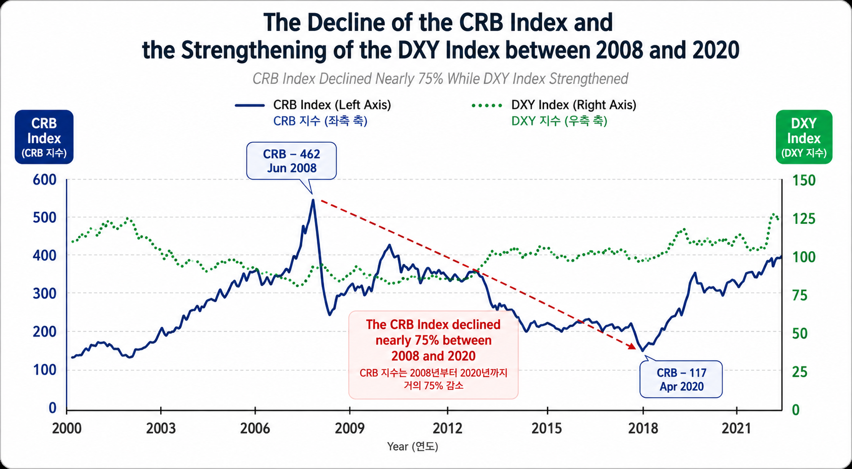
The core evidence this diagnosis leans on is a single chart. From 2008 to 2020, M2 money supply grew from $7 trillion to $20 trillion and Fed assets from $1 trillion to $8 trillion — yet the CRB Index, which tracks commodity prices, fell about 75%, from 462 to 117. Why, with all that money printed, did asset prices rise instead of consumer prices? The author reaches for the Cantillon Effect2 here: newly created money flows first into the assets of those who receive it earliest, rather than spreading evenly through the economy.
Up to this point, I agree. The problem starts after this.
Looking at That Chart a Little Longer
Look at the chart again, and two things stand out.
First, the position of the two points. The starting point, June 2008, marks an all-time high in commodities, with oil racing toward $147 a barrel. The ending point, April 2020, is the exact month when COVID demand evaporated and WTI futures settled at negative $37 a barrel. Draw a straight line between an all-time high and an unprecedented negative price, and you can construct any story you like. This is even more true for the CRB, given its heavy weighting toward energy. A large share of that 75% decline is a number produced by the peculiarities of those two months — not by monetary policy.
Second — and this matters more — you have to look at the right edge of that chart. After bottoming at 117 in 2020, the CRB kept climbing, settling in the 400s in 2024–25, and at the very right edge of the chart it shoots up nearly vertically toward 500. That’s above the 2008 peak of 462. Over the same period, the Dollar Index has stayed around 100.
What does this mean? The author’s frame is “a strong dollar means weak commodities.” But the most recent stretch of the very chart the author cites shows the dollar at 100 while commodities sit at an all-time high. The frame has already broken down. It’s a scene where the cited data is fighting against the conclusion of the person citing it.
The actual recent numbers point the same way. International oil prices went from $57 a barrel at the start of this year to $113 in April, and now sit around $84. Gold was $4,304 an ounce as of August 5. Core PCE inflation actually rose, from 3.0% last December to 3.4% in May this year. This isn’t hyperinflation. But it’s also no longer the 2010s world where “printing money doesn’t raise prices.”
The Third Door Warsh Is Actually Walking Through
So which door did Warsh actually walk through? Last month’s FOMC gives us the answer.
On July 29th, the Fed held its policy rate at 3.50~3.75% for the fifth consecutive time. The vote was 9 to 3. Three members dissented, pushing for a 0.25 percentage point hike — the most dissents in a single meeting since 2016. At the press conference, Warsh said the 2% target is “an absolute target, not something with an implicit ceiling.” He added that inflation, which has run above target for over five years, “won’t be resolved by nine weeks or a month of falling prices.” The rhetoric was decidedly hawkish.
 So why didn’t they hike? Here’s Warsh’s explanation: “Market tightening has already done part of the Fed’s job for it.”
One more piece needs to go on top of this for the full picture to emerge. The Fed’s balance sheet shrank from a 2022 peak of $9 trillion down to $6.6 trillion, but since last December, it has been buying short-term Treasuries again, citing the need to secure system liquidity.
Put it all together and here’s what you get: hawkish language, a rate hold, and liquidity quietly flowing back in. Rising long-term rates aren’t recast as the Fed’s failure — they’re relabeled as “tightening the market did on its behalf.” This is the third door. A path that avoids the political cost of both tightening and easing, by declaring neither.
And for this door to stay open, it needs one justification: the story that productivity is rising, so growth can happen without inflationary pressure. The AI productivity narrative I covered in the last issue is exactly that justification. As long as that narrative holds, easing never has to be called easing. Last issue I used the phrase “stimulus that never hits the books” — and this FOMC meeting looks like the first real-world case of that stimulus actually being executed.
July 29th, the Bond Market Issues Its First Report Card
The advantage of the third door is that you don’t have to declare anything. The disadvantage is that nobody has to believe it.
Right after the press conference, the 30-year Treasury yield jumped 14bp in a single day, breaking past 5.23%, and by July 31st it climbed to 5.28%. That’s the highest level since July 2006. On the same day, the 2-year yield actually fell 5bp. As a result, the spread between the 2-year and 30-year widened 19bp in a single day, reaching 102bp — an extreme not seen in 30 years. Stocks fell in tandem. The S&P 500 dropped -1.5%, the Nasdaq -1.7%, and the Dow shed more than 1,100 points, falling -2.2%. The dollar index reversed from a peak near 101.5 in early July and slid down to around 99.5 by early August.
Let me read this combination piece by piece.
A steepening3 where short-term rates fall while long-term rates rise is the market’s way of saying, “The Fed won’t hike right now, but as a consequence, inflation will run higher later.” Stocks and bonds falling together is a pattern that shows up when the worry is about credibility, not the economy. In phases where stocks fall because the economy is weakening, bonds typically rise. The fact that both fell together means what the market discounted wasn’t growth — it was the promise itself to tame inflation.
 Some are calling this the return of the “bond vigilantes”4. I read it a bit differently. It’s not that the vigilantes punished the Fed — it’s that the Fed outsourced its own job to the market, and the market sent an invoice. The moment you say “the market tightened for us,” the authority to set the price of that tightening also transfers to the market. That price is 5.28% on the 30-year.
This is where the real constraint reveals itself. With national debt approaching $40 trillion, long-term rates in the 5% range aren’t just a number. It’s the threshold toward fiscal dominance5 — a state where fiscal policy holds monetary policy hostage. I think the forecasts in Shan’s scenario table are exaggerated, but I believe they got this particular constraint exactly right.
Oswald’s Lens
I’ve run scenario workshops many times in my strategy consulting work, and in my experience, the most dangerous moment is when a two-column “A or B” table shows up in the room. When a table only has two boxes, people focus so hard on picking one that they stop looking at what’s outside the table. And the path an actual organization takes is almost always C: the route where nobody declares either outcome, everyone buys time, and the situation is left to make the decision for them. A binary table is less an analytical tool than a persuasion tool.
There’s a similar habit on the data side. Drawing a straight line between two extreme points is the easiest way to manufacture a correlation that doesn’t exist. Summer 2008 and April 2020 — the moment you pick precisely these two months, the conclusion is already baked in.
So I hold this table to the same standard as last issue. At the end of the last issue I wrote that “a forecast with no falsification condition isn’t analysis, it’s sales.” That standard has to apply equally to positions I happen to agree with. Gold at $24,000, the Dollar Index below 50 — without a deadline, without specifying what data would make you drop the forecast, there’s no way to falsify it. An unfalsifiable prediction can’t even be wrong, which makes it not very useful either.
The Door Three hypothesis, by contrast, has a very clear falsification condition. That’s the practical part of this piece, so I’ll lay it out separately below.
In fairness, there’s something worth leaving on the other side of the ledger too. I don’t think Shan’s sense of direction is entirely off. Given a combination of 3%-range inflation, long-term rates in the 5% range, and $40 trillion in debt, believing the Fed can stay politically untouched would actually be the naive position. Still, there’s no reason that pressure has to end in Weimar. Most currency stress doesn’t pass as a collapse — it passes as a long, grinding erosion that nobody ever gets around to calling a crisis.
Closing
Let me sum this up in three lines. The chart that frames Waller’s choice as a binary between austerity and easing is dramatic, but the very chart it leans on is fighting its own conclusion. The path the Fed is actually walking is door number three—a mix of hawkish language, frozen rates, and quiet liquidity provision that declares nothing. And on July 29th, the bond market put a price tag on that path: 5.28% on the 30-year.
So the indicator to watch going forward isn’t the policy rate. It’s these two: the 30-year yield and the 2-year/30-year spread. If the spread keeps widening, that means door number three isn’t working. If it narrows and long-term rates come down, the narrative has succeeded in persuading the market. This is also where my hypothesis gets falsified. If the 30-year drops into the mid-4% range and the curve flattens, I’m wrong.
Are you currently treating a 5%-plus long-term rate as a constant in your business planning or investment calculus—or are you betting it comes down soon? Either way, tell me in the comments what decision you’ve built on top of that assumption. If enough examples come in, I’ll dedicate a future issue to “the moment an assumption becomes a constant.”
This piece is not investment advice for any specific asset. All forecasts cited are the original authors’ own projections, not verified facts—please keep that in mind as you read.
💬 Do you see the 5%-plus long-term rate as a constant, or a variable? Tell me in the comments what decision you’ve built on top of that assumption. 📨 If you know a colleague who has to make calls resting on exchange-rate and interest-rate assumptions, share this piece with them.
References & Further Reading
Primary sources
- Wall Street CN (华尔街见闻), “Warsh Has Only Two Paths Ahead,” 2026. Link ··· This is where today’s piece begins. It’s the original source for the two-scenario table and the CRB/DXY charts. I’m arguing against it, but the logical structure is well put together and worth a read.
- CLS (財聯社), “Behind Wall Street’s Simultaneous Stock-Bond Selloff: Warsh Has Been ‘Exposed’,” 2026.7.30. Link ··· Source for the numbers on the 30-year jumping 14bp in a single day and the 2-year/30-year spread widening to 102bp.
- Wolf Richter, “Six Years into Bond Bear Market, 30-Year Treasury Yield Hits 5.28%,” Wolf Street, 2026.8.1. Link ··· The opposite read on curve steepening — normalization, not crisis. Worth putting side by side with today’s piece.
- U.S. Bank, “Federal Reserve Holds Rates at 3.50%–3.75% in July 2026,” 2026.7. Link ··· This is where the baseline figures in this piece come from: the 9-3 vote, core PCE at 3.4%, a $6.6 trillion balance sheet, and short-term Treasury repurchases.
- CNBC, “Fed’s Warsh Fails First Test as ‘Bond Vigilantes’ Drive Yields Higher, Says Ed Yardeni,” 2026.7.30. Link ··· Yardeni himself — the man who coined “bond vigilantes” — reading this exact moment.
- CNN Business, “Takeaways from Fed Chairman Kevin Warsh’s First Congressional Testimony,” 2026.7.14. Link ··· A rundown of his first testimony after taking office. This was also the starting point of last issue.
Background
- “Cantillon effect,” Wikipedia. Link ··· A 300-year-old insight that who gets new money first changes how it’s distributed. This is the one point in today’s piece where I actually agree with the original author.
- “Bond vigilante,” Wikipedia. Link ··· The history of the concept Yardeni coined in the 1980s. Looking at the 1994 and 2022 cases shows this moment isn’t unprecedented.
Related past issues worth reading
- Why Does the New Fed Chair Talk Like a Startup Founder? ··· Part one of today’s piece. It covers how the AI-productivity narrative — the signboard hung on that third sentence — was constructed.
- $250 Billion Spent, So Why Doesn’t It Show Up in the GDP Numbers? ··· The piece that laid out the productivity-lag hypothesis at the root of that narrative.
📝 Glossary

Footnotes
-
Monetization of deficits: A state in which the central bank effectively absorbs the government’s borrowing. When a central bank buys government bonds on a massive scale, the government can borrow with less regard for market pushback — at the cost of diluting the currency’s value. ↩
-
Cantillon effect: The phenomenon where newly issued money doesn’t reach everyone at once, so whoever receives it first benefits most. This is why pumping out the same amount of money can sometimes inflate asset prices instead of consumer prices. ↩
-
Curve steepening: When long-term rates rise faster than short-term rates, making the yield curve’s slope steeper. The current pattern — short-term rates falling while long-term rates rise — is read as a market signal that “we’re more worried about inflation far down the road.” ↩
-
Bond vigilantes: Investors who sell off long-term government bonds to push up interest rates when they distrust the government’s or central bank’s response to inflation. The term was coined by Ed Yardeni in the 1980s. ↩
-
Fiscal dominance: A state in which government debt has grown so large that the central bank starts prioritizing the government’s interest burden over inflation control. Once this threshold is crossed, control over interest rates effectively shifts to fiscal policy. ↩
Related issues
 Issue #182Business
No Solo Unicorn Yet, but Solo Millionaires Have Doubled
The prophesied one-person unicorn never arrived, but payment data reveals a new way to grade solo-founder success stories.
 Issue #181Business
$800 Billion: The World's Most Famous Wrong Number
It undercounts global AI spending by $200 billion while overcounting America's by exactly the same amount.
 Issue #180Business
Why I'd Log 50 Hours for a 30-Minute Job
It's not personal integrity that's broken — it's the billing unit.
Your take shapes the next issue
What resonated most in this issue, or where has your experience been different?